
Oncoscape
Usability Testing & Evaluation for a Cancer Data Visualization Web App
Goal & Result
My goal was to discover the obstacles users face in their use of a cancer data visualization web app. I looked specifically at the clinical timelines and dimension-reduction scatterplots features, and provided usability improvement recommendations.
Role: User Experience Researcher & Designer
Result: Usability Issues & Recommendations Report, Figma wireframes for design solutions
Conducting User Interviews
to get in-depth insights & problem context

I chose to explore usability issues by conducting a round of user interviews. This was crucial to gaining insight on what high priority issues I was going to tackle through the rest of the project.
Conducting user interviews allowed me to get an in-depth look at the context of the problem and helped me think about issues from multiple viewpoints.
Project managers, clinicians, and researchers all had different pain points and goals with their use of the web app, and I had to balance all of their insights as I analyzed the interview results and provided design recommendations.
A few of my Interview Questions:
Can you tell me about how you might use Oncoscape? What features do you utilize the most?
What are the most important features in exploring the data or completing [task]?
& balancing diverse perspectives
Data Analysis
After conducting the user interviews, I synthesized interview transcripts and notes into insights through conducting an affinity analysis.
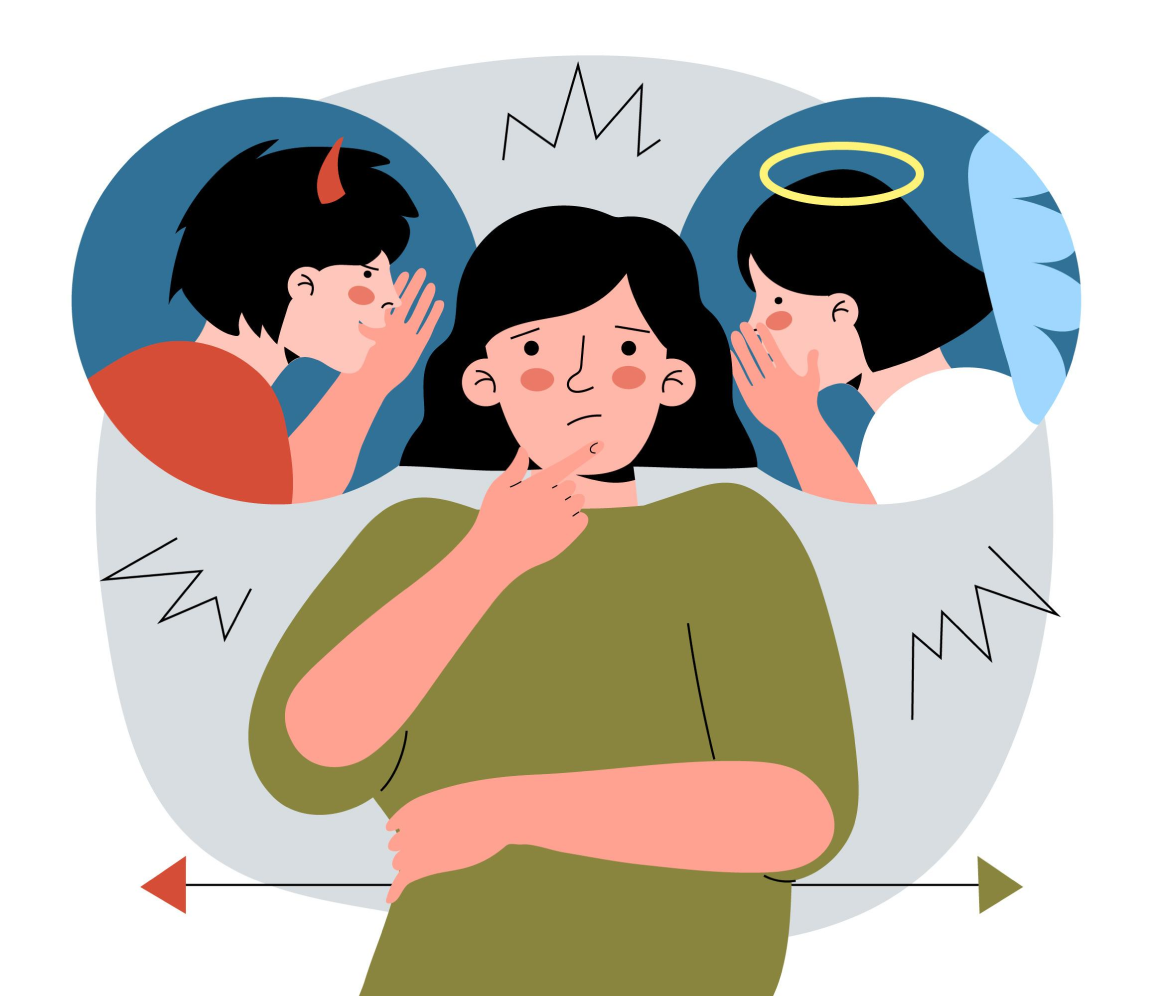
How did I prioritize different perspectives?
In this project, the clinicians and project managers all had a different idea of what they wanted the ideal Oncoscape Web App to look like. To best address their issues,
I prioritized the
evidence of the strongest issues
common problems reported across all users
cross-validation of issues/evidence
Two Big Usability Issues
In my analysis of the interviews, I discovered two big issues, which are supported by quotes from different interviewees.

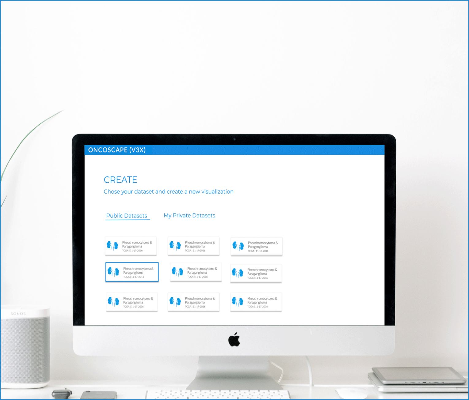
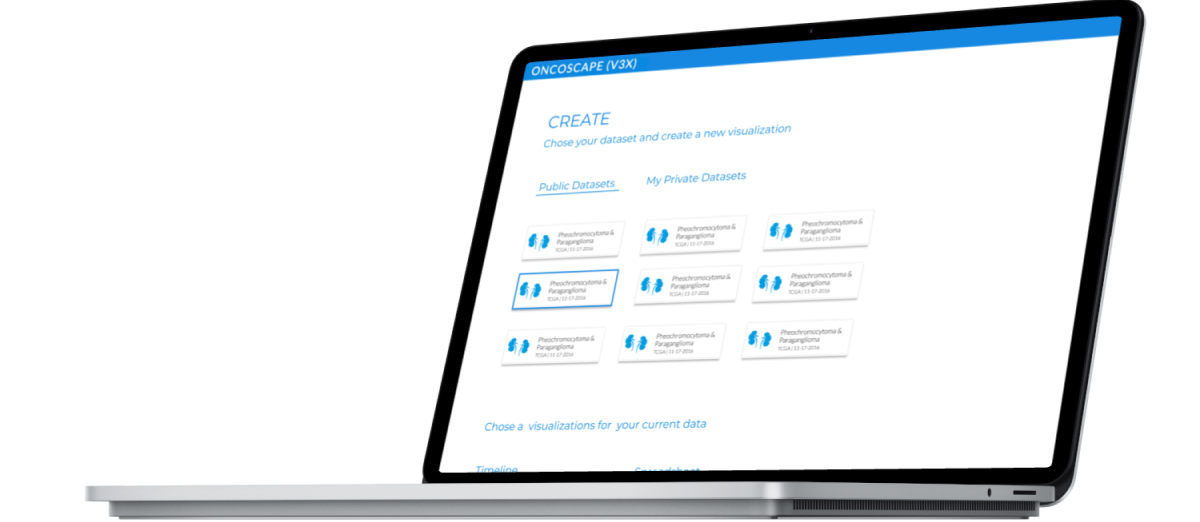
Navigation Issues
“If I want to change to timelines [from dimension-reduction], where do I go? It’s buried”
Learning Curve Issues
“How can I switch between Data timelines and molecular?”
“In Tableau (competitor) I can figure it out myself” — referring to difficulties with learning how to use the tool
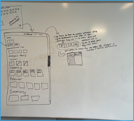
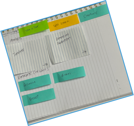
& Dashboard Summary Designs
Navigation Issues
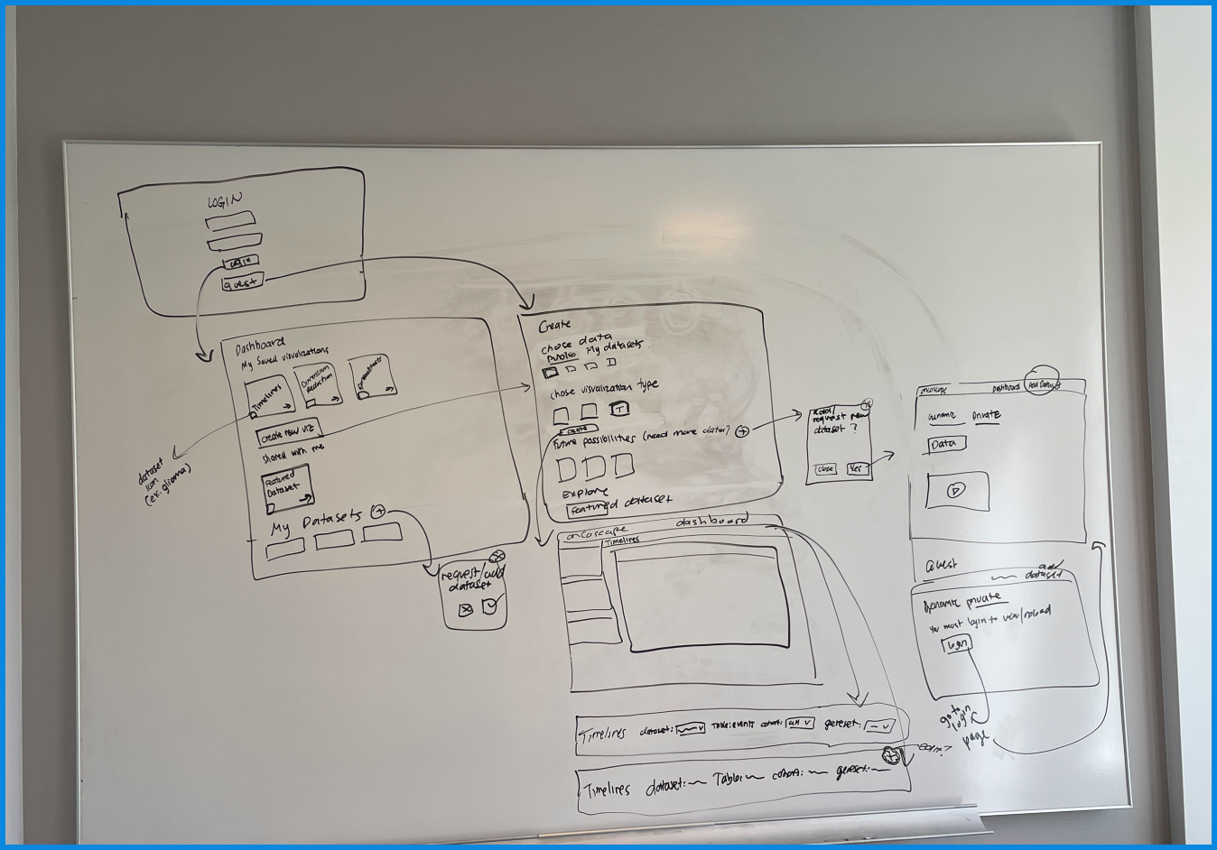
Based on my research, I created a research results report. After sharing the results including the biggest usability issues, the team and I decided to create sketches of a dashboard summarization page to solve navigation issues.
This dashboard summary would allow users to
access relevant information and recently used shortcuts, datasets.
be presented with most used tools
click their most recent visualization or dataset, and get right back to work!
add more datasets or visualizations
& designing helpful hints features
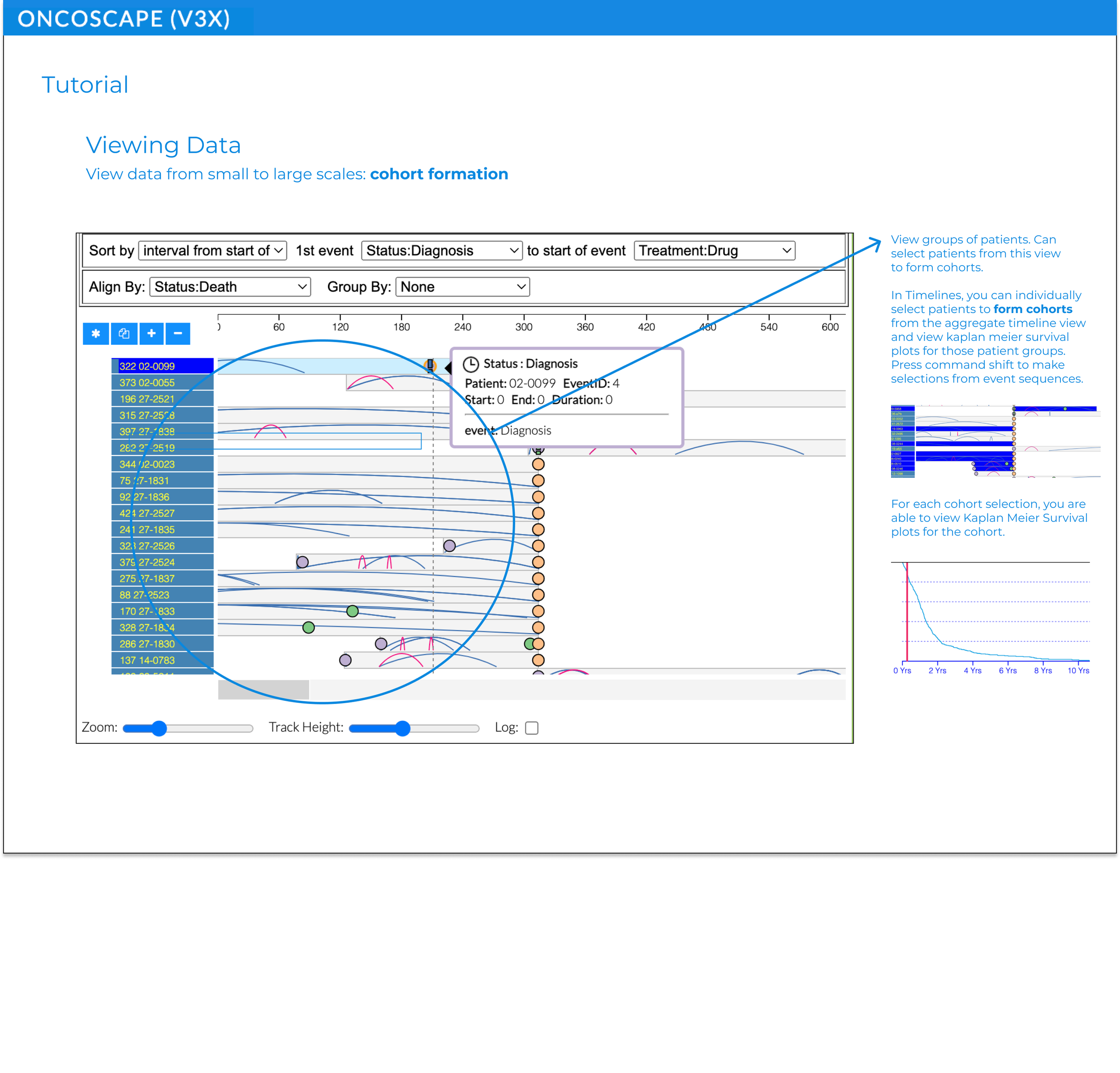
Tutorial Features
Since several users expressed that Oncoscape was difficult to learn to use, the team and I decided to explore a “helpful hints” tutorial option.
We wanted these tutorial features to help inexperienced users but not get in the way of experienced ones.
for navigation & tutorial features
Final Design Recs

Dashboard for Navigation Issues
A dashboard where users can choose analysis tools and go to switch analysis tools.

Tutorial Features for Easier Learning
Pop-ups signified by blue ‘I’ icons to help users if needed. Short video clips could be added instead of pictures if necessary.
As a Designer & Researcher
My Growth
Despite my struggles with balancing a wide variety of stakeholder perspectives, I gained confidence in my design skills and refined my research process.
I also learned how to
conduct and analyze interviews with the goal of qualitative insights.
consider the feasibility of a design by working with data visualization engineers.