
Restimate: A web app for natural disaster recovery
Content Design Research & Usability Evaluation
Goal & Result
The focus of this project was to conduct research to find out how to improve the content of an early stage critical infrastructure data visualization tool. Initially, we focused on improving map graphics specifically.
Role: Content Design Researcher
Results: Integration of facilitator prompt in the final design of Restimate website.
choosing a focus area for our research
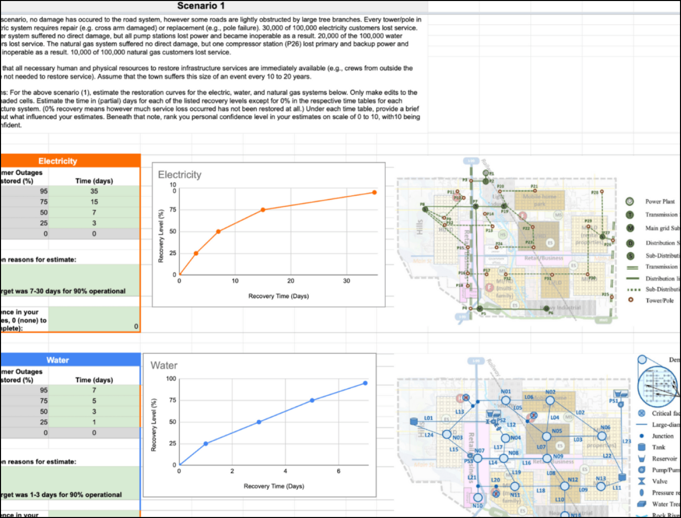
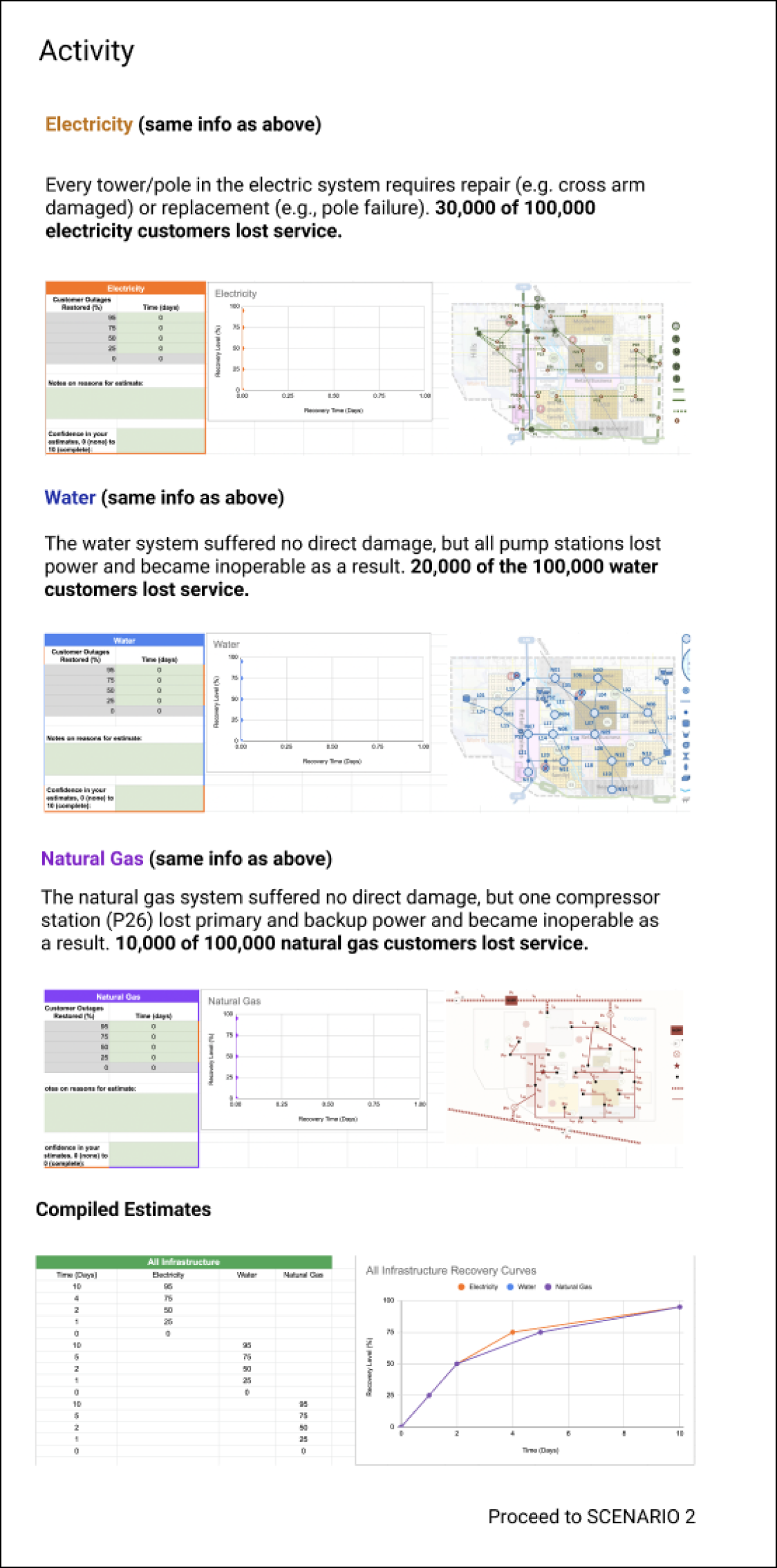
Interest in Map Graphics
Our goal was to redesign the content of the tool to make it easier to read, understand, and use. Initially, we decided to focus on investigating improving the map graphics, because we thought they were hard to understand and might impede estimation efforts.
Understanding users interactions with maps
Usability Testing
Initially, we were most interested in understanding how users' interpretation of the map graphics influenced their estimates and how we could improve them.
We chose to conduct usability tests because the tool was already created in a Google Spreadsheet and we wanted to use the existing tool to guide our research. It was also a great way to talk to users and get in-depth insights.
Maps didn’t present the most pressing issue for users
Are we solving the right problem?
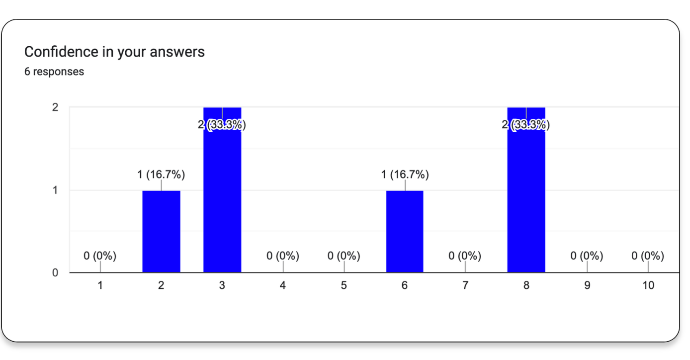
We sent out a survey for users to answer after their usability tests.
Average confidence was only 4.4/10, when rated on a scale of 1 to 10. Average usefulness of the map graphics was only 4.6/10.
So, map graphics weren't incredibly useful to participants as they made their estimates. They seemed to rely more on the background content information, and our whole project was focused on redesigning the maps. Uh-Oh.
Trying not to Panic
and pivoting to a different research direction

Despite the fact map graphics weren’t a big factor in users’ recovery ratings, We uncovered a surprising insight/pain-point in our survey and usability testing: users lacked confidence in their estimates. We created the below chart to try to narrow down our research direction and get insight on next steps.Pivoting to a different research direction
Pivoting to ease uncertainty
Prioritization of findings
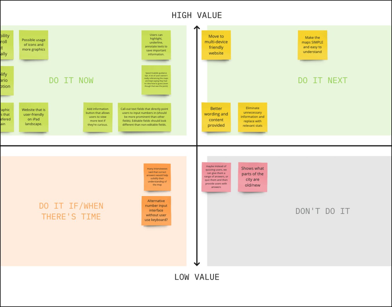
At this point we had identified some paint points from our research and reviewing the research findings of other groups.
We decided to create a prioritization map. We found that the redesigning the map graphics wouldn't be as helpful as finding a way to ease uncertainty in using the tool, since users were unsure if they should guess while making estimates.
We also wanted to break up of content to improve readability (there was a lot of block text that was important but users skimmed through) and simplify the scenario descriptions.
Our Content Design Solutions
for navigation & tutorial features
Facilitator Prompt
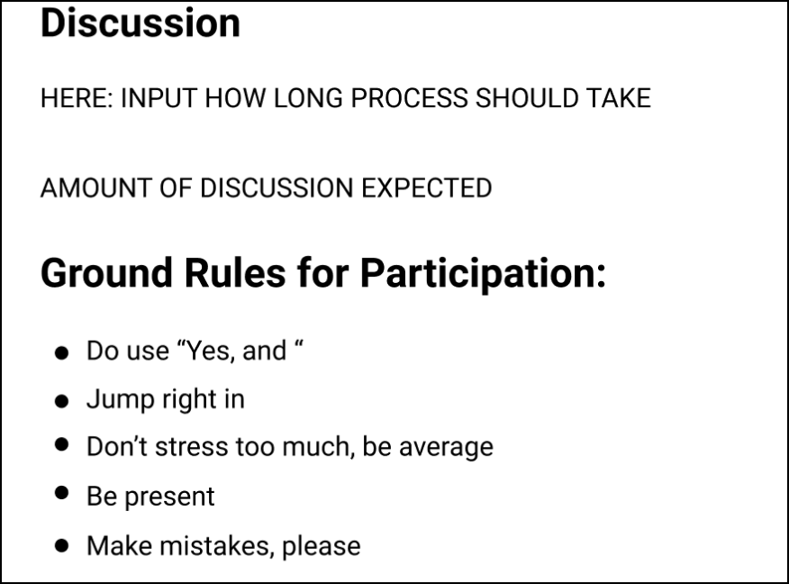
This was our solution to addressing the lack of confidence users displayed in making their estimates. This prompt was not perfect, but a representation of a disclaimer to help ease concerns.
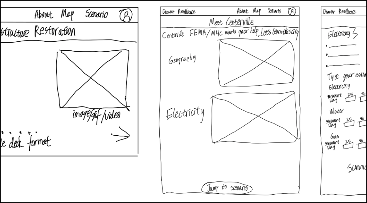
Information Layout
This Background Content Design in Figma is the result of a combination of our group's ideas, and part of our final submission for the research project.
As a Designer & Researcher
My Growth
Through this project, I learned how to be flexible in my design process and pivot to other directions.
I also learned how to
make sure I am solving the right problems
conduct user interviews w/experts
synthesize survey results